Who ever said that serious productivity had to be boring? Each day our community made up of users just like you inspires us with the incredible things they accomplish. You deserve an equally inspiring to-do list.
Today, we’re bidding a (not-so-tearful) farewell to a grey, utilitarian Todoist in favor of bold color, beautiful animations, and seamless interactions. After nearly a year of code wrangling and pixel perfecting, Todoist for Android’s Material redesign is finally here!
Since we released the first version of Todoist for Android in November of 2012, millions have come to rely on its powerful task management features to keep their important projects moving forward. Over the past two and a half years, our small but growing Android team has worked hard to make our app as intuitive and useful as possible for our community’s personal and team productivity. But we knew there was still huge room for improvement in both user experience and functionality.
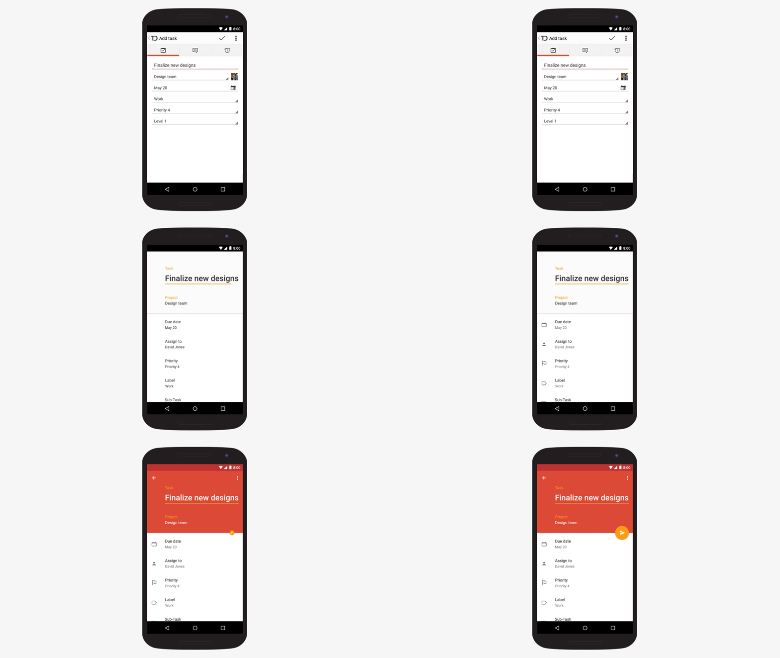
In this Material design update, we left no screen or interaction untouched in our quest to build the most beautifully intelligent to-do list available for Android. In addition to the completely renewed look and feel, we drastically simplified key actions and added some brand-new features to help you feel completely organized and in control of your to-do list. It’s without a doubt the most comprehensive revamp of our Android app yet.
The New Features
We know you’ve been waiting patiently for this update, so let’s dive right in and take a look at exactly how the new Todoist for Android can help you achieve your personal and professional goals with less time, stress, and effort.
Capture your tasks on the fly with intelligent quick-add.

Getting your ideas out of your head and onto your to-do list frees up mental space and allows you to focus on the task at hand. Our new quick-add makes decluttering your brain almost entirely frictionless. Just tap the ‘add’ button floating at the bottom of the screen and type the task name, priorities, labels, and due dates all in one line. The intelligent in-line adding will automatically recognize, highlight and categorize all the details for you. The new date parsing– one of the most advanced in the world– is available in 14 languages and supports over 300 rules per language so you can describe your quick-add due dates in a way that’s completely natural for you.
Use start and end dates to stay on top of your busy schedule.

Many of you rely on recurring due dates to make sure nothing slips through the cracks. That’s why we’ve completely revamped date input for Android to include start and end dates. Now you can easily capture even your most complicated recurring due dates in Todoist. Add a task to “read three chapters every Sunday starting Aug 1st and ending Nov 15th” or “Go for a run at 7am every day starting today and ending Oct 26th”. The scheduling possibilities are practically endless.
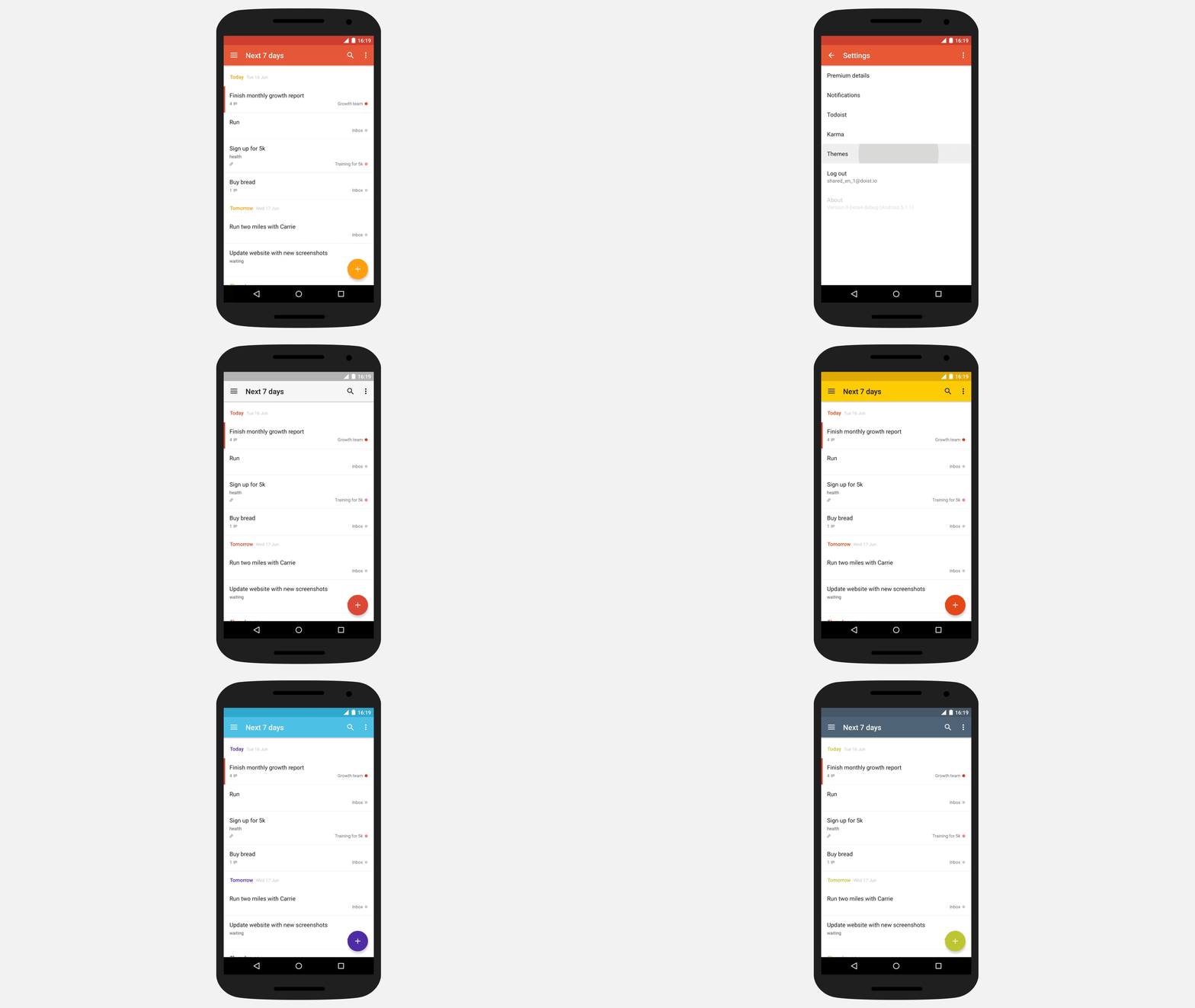
Make your to-do list your own with colorful themes to fit any mood and personality.
For a little something extra, it’s now possible to personalize your to-do list with one of ten delightful color themes (with equally delightful names :) ). Choose from Todoist red, tangerine, sunflower, clover, blueberry, sky, amethyst, noir, graphite or neutral.
Easily create sub-tasks to keep your big projects moving forward.
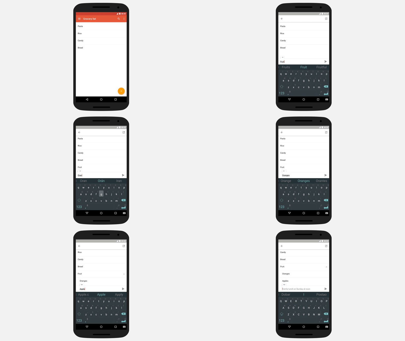
Being able to break down big projects into small, manageable tasks is an essential step to accomplishing your important goals. Now, you can organize complex projects directly from your Android device. Just swipe right on the drag handle during the quick-add, and you will be able to instantly convert the new task into a sub-task.
Simply swipe to schedule and complete your tasks.
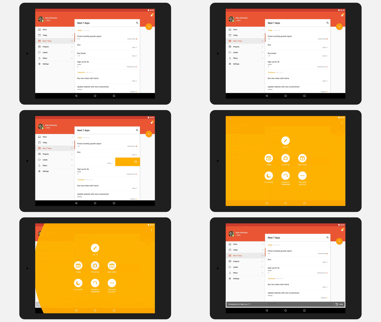
Managing your tasks should be an entirely seamless experience. With today’s update, a swift swipe to the left will let you schedule a task, while a swipe to the right will render a task complete. These actions have been redesigned according to Google’s Material gesture guidelines to make them both intuitive and beautifully simple.
Quickly add collaborators to keep your team on the same page.
Being able to communicate with collaborators and delegate tasks is key to keeping your team projects on track. Today’s update makes it easier than ever to keep everyone on the same page by allowing you to immediately invite collaborators as you create a new project.
A complete Material redesign for a more intuitive, inspiring experience.

Managing your tasks shouldn’t feel like a chore you have to force yourself to do. Following Google’s Material design guidelines, we’ve made radical changes to each and every screen and interaction to make sure your to-do list is cleaner, brighter, more intuitive, and overall more inspiring.
Bonus: upload larger files on any platform [Premium].
Our team of engineers has just rolled out an additional update that will let Todoist Premium and Todoist for Business users upload much larger files to their tasks. From 20MB to 100MB, this bonus feature will be available on all of Todoist’s 15+ platforms, including Android!
One user’s favorite new features

Rita Khoury has been using Todoist for over two years and, as one of our long-time beta testers, we wanted to hear how the app’s new improvements have helped increase her productivity as a business owner. It also so happens that she is an Android expert :) Here are her thoughts after two weeks with the brand new Todoist for Android:
I’m a procrastinator at heart and I tend to forget what I am supposed to do, two qualities that don’t mesh well with being a business owner, especially when said business is a pharmacy that people’s well-being rely on. For the past two years, Todoist has been my second brain. I prepare my daily medicine orders, keep track of out-of-stock brands and generics, manage my due credit notes, and rely heavily on the service’s projects, labels, and priorities to keep my entire business running as smoothly as possible. I even started making personal to-do lists – something I had tried and always failed at prior to Todoist.
This new version makes both my business and personal life management even easier. I’m constantly swiping tasks to the left to reschedule them – “it can wait,” the loiterer in me says, and off goes the task to next week. Then I remember that I have to add a reminder to it and I’m happy that the function is now one click away instead of being tucked in a secondary menu. Search is also more accessible, which speeds up my hunts for out of stock medicines.
But the two features I love the most about this Todoist update are the new design and intelligent input method. The app looks great on my phone thanks to its Material Design touches – animations, bold colors, floating action buttons – and it now understands things like, “Lumigan for dad @orders p1 today @8pm,” without me having to go into several sub-menus to manually pick the label, priority, and due date. These two features almost make me forget that I’m using a productivity app and that task management is supposed to be a chore, not an enjoyable experience.
We can’t wait to hear what you think about all these useful new updates to Todoist for Android! Download the app today to start getting more done with less time, stress, and effort.
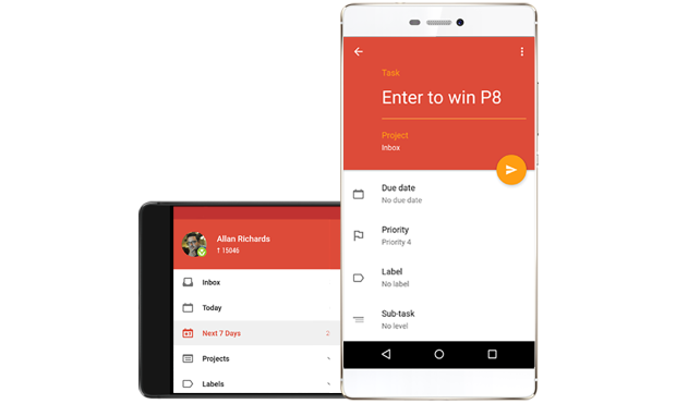
We’re giving away 2 brand-new Huawei P8 phones to celebrate!
Our friends at Huawei wanted to help us celebrate our biggest ever update to Todoist for Android. That’s why they’ve given us two of their brand-new Huawei P8 smartphones to give away to two lucky winners. As a bonus, each device comes pre-loaded with a full year of Todoist Premium! Simply enter below for your chance to win.
The contest starts today (June 23rd) and will end on Tuesday, July 7th at 9:00AM ET. The two winners will be announced here in this post on July 7th, and each one must be a current Todoist user to win.
After dozens of Google Hangouts, hundreds of design mockups, thousands of lines of code, countless espressos, and a few late nights, we are so excited to finally be able to share this Material redesign with you. We put a lot of careful thought and hard work into building an update that we think is worthy of our awesome Android community.
Please share your comments with us below– we’re looking forward to incorporating your feedback into the next update!

